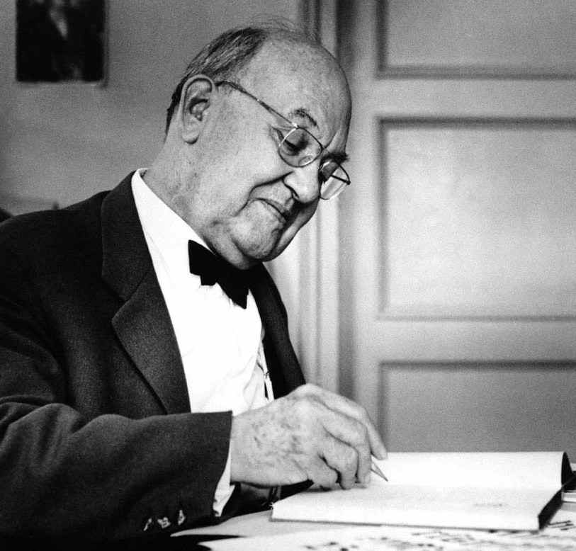
Jan Tschichold stands as one of the most influential figures in the history of graphic design. His ideas reshaped typography in the twentieth century and continue to influence designers, publishers, and branding professionals across the United States and around the world. When discussing the foundations of modern layout systems, grid structures, and typographic hierarchy, the name Jan Tschichold consistently emerges as a defining authority..
Early Life and Formative Years
Born on April 2, 1902, in Leipzig, Germany, Jan Tschichold grew up in a household where craftsmanship mattered. His father was a sign painter, and from a young age, he was exposed to lettering, spacing, and hand-drawn precision. That early immersion gave him a deep respect for structure and visual clarity.
Unlike many artists of his generation, Jan Tschichold did not begin as a rebel. He initially trained in traditional calligraphy and classical typography at the Leipzig Academy of Graphic Arts and Book Production. His early work followed historical conventions, rooted in symmetry and ornamentation.
However, everything changed in the 1920s when he encountered modernist ideas emerging from the Bauhaus movement. These ideas would ignite a transformation that positioned Jan Tschichold at the center of a design revolution.
The Birth of “New Typography”
Breaking Away from Tradition
In the mid-1920s, European design was undergoing radical change. The chaos of post–World War I Europe demanded clarity and functional communication. Inspired by constructivism and Bauhaus principles, Jan Tschichold embraced asymmetry, sans-serif typefaces, and structured layouts.
He rejected decorative excess. He believed typography should communicate clearly and directly. To him, visual clarity was not optional—it was ethical.
In 1928, he published his groundbreaking book Die Neue Typographie (The New Typography). The publication outlined strict principles for modern design:
- Use of sans-serif fonts
- Asymmetrical layout
- Standardized paper sizes
- Clear hierarchy through contrast
- Functional, objective design
This book transformed Jan Tschichold into a leading voice in modernist typography. Designers across Europe and later the United States studied and adopted his systematic approach.
Influence on American Designers
Although his early work emerged in Germany and Switzerland, the ideas of Jan Tschichold traveled quickly to American design schools and publishing houses. By the 1930s and 1940s, modernist typography began influencing U.S. advertising, magazine design, and corporate identity systems.
The American emphasis on clean branding, bold headlines, and rational grid systems owes much to the typographic discipline introduced by Jan Tschichold.
Political Turmoil and Exile
The rise of the Nazi regime in 1933 dramatically changed his life. Modernist art was labeled “degenerate,” and Jan Tschichold was arrested for promoting what authorities considered culturally subversive ideas. After his release, he fled to Switzerland with his family.
This period marked both personal hardship and creative transition. While living in Basel, he continued teaching and refining his design philosophy. Ironically, during exile, Jan Tschichold began questioning the rigidity of his earlier modernist principles.
A Surprising Shift Toward Classicism
Reevaluating Modernism
By the late 1930s and early 1940s, Jan Tschichold openly criticized his earlier strict rules. He realized that extreme asymmetry and rigid modernist systems could feel cold and mechanical. Typography, he believed, also needed warmth and human proportion.
This transformation shocked many designers who saw him as the ultimate modernist authority. Yet it demonstrated intellectual honesty. Jan Tschichold did not cling to ideology; he evolved.
He began returning to classical serif typefaces, balanced margins, and harmonious proportions inspired by Renaissance book design. Rather than abandoning clarity, he integrated tradition with discipline.
Penguin Books and Global Impact
Standardizing Paperback Design
In 1947, Jan Tschichold accepted a position in England with Penguin Books. His task was to standardize the visual identity of their rapidly expanding paperback catalog.
Before his arrival, Penguin covers varied widely in layout and spacing. Jan Tschichold introduced:
- Strict margin ratios
- Consistent title placement
- Controlled typographic hierarchy
- Grid-based alignment systems
He created over 500 book cover designs and established detailed composition guidelines. These standards ensured that every Penguin book maintained visual consistency while preserving readability.
Although based in Europe, the influence of Jan Tschichold at Penguin Books directly affected American publishing trends. U.S. paperback publishers later adopted similar systematic approaches to cover design and interior typography.
Core Principles of His Design Philosophy
Clarity Above Decoration
For Jan Tschichold, typography was a service profession. It existed to communicate content clearly. Decorative excess distracted from meaning.
This principle resonates strongly in American publishing and digital design, where clarity drives user experience.
Hierarchy Through Contrast
He emphasized the intelligent use of size, weight, and spacing to guide readers through content. Rather than relying on ornamentation, Jan Tschichold believed structure itself could create beauty.
Respect for Proportion
Even after shifting toward classical styles, proportion remained central to his philosophy. Balanced margins, measured line lengths, and thoughtful spacing defined his mature work.
These principles continue to guide American graphic design education programs today.
Typefaces and Contributions to Letterform Design
Beyond theory, Jan Tschichold contributed directly to typeface development. He worked on refining classical type designs and consulted on type production projects.
While he did not create as many original typefaces as some contemporaries, his influence on how type should be used may be even more significant. The structured approach advocated by Jan Tschichold laid groundwork for modern branding systems and corporate identity manuals.
How His Ideas Shape Digital Design Today
Grid Systems in Web Design
Modern website layouts rely heavily on grid systems. Responsive design frameworks used across American tech companies follow principles remarkably similar to those outlined decades ago by Jan Tschichold.
Clear alignment, predictable hierarchy, and logical spacing all trace back to his typographic systems.
Minimalist Branding
From tech startups to global corporations, clean branding and sans-serif typography dominate American visual culture. The disciplined minimalism championed by Jan Tschichold helped establish this aesthetic foundation.
Even mobile apps reflect his belief that clarity equals effectiveness.
Criticism and Controversy
Not all designers agreed with his ideological shifts. Some critics accused Jan Tschichold of abandoning modernism too quickly. Others argued that his early strict rules were overly dogmatic.
Yet this tension reflects intellectual depth rather than inconsistency. Few designers have been willing to publicly revise their foundational beliefs. His openness to change reinforces why Jan Tschichold remains a respected figure in design history.
Legacy in the United States
Although born in Germany, his influence is deeply embedded in American visual culture.
Design schools across the U.S. teach his theories when introducing typography fundamentals. Publishing houses rely on standardized layout systems rooted in his methodology. Corporate identity manuals reflect structural thinking he helped popularize.
The disciplined elegance found in contemporary American book design, magazine layouts, and branding owes a substantial debt to Jan Tschichold.
Why His Work Still Matters
Typography is often invisible when done well. Readers rarely notice spacing, alignment, or hierarchy unless something feels wrong. That invisibility is precisely what Jan Tschichold advocated: design should serve content seamlessly.
In an era of fast digital production, his emphasis on proportion and intentional structure feels more relevant than ever. American designers navigating crowded visual spaces continue to rely on the clarity principles he articulated nearly a century ago.
(FAQs)
Who was Jan Tschichold and why is he important?
Jan Tschichold was a twentieth-century typographer and designer who revolutionized modern typography through his book The New Typography and later influenced publishing standards worldwide.
What is “New Typography”?
It is a design movement promoting asymmetrical layouts, sans-serif typefaces, and functional clarity, principles strongly associated with Jan Tschichold.
Did he always support modernist design?
No. Later in life, Jan Tschichold shifted toward classical typography, favoring balanced proportions and traditional serif typefaces.
How did he influence American publishing?
His systematic layout standards and hierarchy principles shaped book design practices that were later adopted by U.S. publishers.
Are his ideas still relevant in digital design?
Yes. Grid systems, minimalist branding, and structured typography in modern web design reflect the lasting influence of Jan Tschichold.
Conclusion
Jan Tschichold transformed typography from decorative craft into disciplined visual communication. His early embrace of modernism challenged centuries of tradition, while his later return to classical balance demonstrated rare intellectual flexibility. Few designers have influenced both avant-garde experimentation and mainstream publishing standards with equal authority.